By now, I am sure you have already heard the phrases, ‘mobile first’ and ‘mobile friendly’ but if you’re still questioning the importance of it, I am here to convince you of just how imperative it is that you have a mobile first website. I can guarantee by the end of this article you will have no doubt in your mind of its significance.
An increasing number of users are now mobile-only, which means if you can’t meet their needs you’re losing potential customers. On top of that, Google declared its interest in enhancing user experience and securing more valuable search results by making its mobile-first index.
This means that if you have a mobile optimised website, you will rank higher for both desktop and mobile. However, if someone searches for a term or a phrase that is not represented to the mobile users, the page could be penalised even if it exists on the desktop version.
Contact Us
What Is Mobile First?
Mobile first indexing is a phrase we’re hearing increasingly more as Google continue their pursuit in keeping up with the latest user behaviour trends and technology. But what does it actually mean? Especially as a business owner, is being mobile friendly enough? Aren’t they the same thing? The answer to the last question is, no. There is still a lot of confusion about the difference and what they mean.
So What Is It?
Mobile first is the concept of designing your website with the primary focus being mobile users then adapting it to make it suitable for larger screens. This is in stark contrast to the ways of the past where websites were built primarily for desktop users with mobile being the secondary thought. This is important because user habits are changing which means as a business you need to adapt to the needs of the user as to not isolate potential customers. The main goal of building your site to be mobile first is to enhance the mobile users experience.
This is where the difference between mobile friendly and mobile first come in. You may be thinking to yourself that your website works perfectly on mobile even though it was originally built with desktop users in mind? Which it may well do, this means that it’s mobile friendly.
And What Is Mobile Friendly?
At its simplest, mobile friendly design means your website’s information – images, texts, videos, links – is easily and readily accessible across all different platforms and, most particularly, on the much smaller screen of smartphones and tablets. However, it has been adapted to be mobile friendly not designed to be mobile first.
So Now You Know What Mobile First Is, What Is Mobile First Indexing?
Mobile first indexing is when your Google ranking is determined by the mobile version of your website. This will be what Google includes in their index. If you monitor crawl-bot traffic to your site, you may see an increase in traffic from Smartphone Googlebot, and the cached versions of pages will usually be the mobile version of the page.
If your website does not have a mobile-friendly version, it can still be indexed (this is why it’s called mobile first) but it will likely be penalised and ranked lower than a site with a better mobile experience even if your desktop offering is better.
Should I Forget About Desktop Users?
In short, absolutely not! It simply means that the mobile version of your site will be the primary version, but you still need to make sure your website is responsive across all platforms. Ideally your website should be optimised in equal amounts for both mobile and desktop to improve your sites performance in search results.
What Should My Next Steps Be To Embrace Mobile First?
It’s definitely time to start making progress towards a mobile friendly / mobile first site but don’t worry if you’re not quite there yet. Google is rolling this out gradually as to not negatively impact businesses. In fact, they are currently only testing on websites they deem ready as to not have a damaging effect.
As previously mentioned, in an ideal world your desktop and mobile versions of your website would be of equal status – if this is the case you may not need to do anything at all if you’re currently sitting pretty in terms of Google ranking.
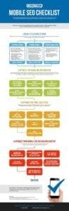
Check out this infographic for more information:
What’s Key To The Best Mobile User Experience?
If you read our previous article on page speed then you’ll already know the importance of mobile page speed and load time. It’s imperative that your site is optimised to minimise any delays when it comes to the user experience. An important thing to remember here is that with mobile first indexing any content, which is collapsed or hidden in tabs, will still be indexed the same as visible content.
You should also focus on what the user actually wants and/or needs from your website then aim to design your site around optimal functionality, this way your site will only include relevant content and will not be cluttered with things that only slow your customer down.
Why It Is So Important
Having a mobile responsive web design is no longer an optional bonus; it’s a necessity if you want to remain in the game long term! Being able to offer your users an optimised experience regardless the device they use means you can extend the reach of your product or service, in turn, growing your business and engaging with more people.
Benefits Of Having A Mobile First Website
If you want the best possible experience for your user then designing for mobile can help you achieve this. Your site should always be designed to find the easiest and most effortless way for your customers to reach their desired goal – especially mobile users.
By using mobile first web design, you are designing your layout with friendly user experience in mind; desktop designs and functionalities may not work well scaled down for mobile. Using a mobile first approach you ensure a clean all-round website design. This way of designing is also beneficial when it comes to page load times and users finding what they want quickly and easily. When you design from the smallest screen (mobile) to the largest screen (desktop) this is known as progressive enhancement, which means you have a strong foundation to build on.
In short…
- It design means your website will be responsive so customers using any device can have a great user
- It makes you simplify and think about your content and breaks it down into digestible portions
- Mobile users are growing by an unfathomable rate
- Designing for mobile first means the foundation is there to easily build on for larger sized
- The designs are simple and easy to use
Your Mobile First Website
Whether you’re building a new website or improving an existing one, mobile first and mobile friendly design is one of the most important criteria’s to take into consideration. Here at AIM Internet we can help you improve your user experience and your Google ranking simply call us on 0207 856 0418 or email us at info@aiminternet.co.uk.
